Elements of Design
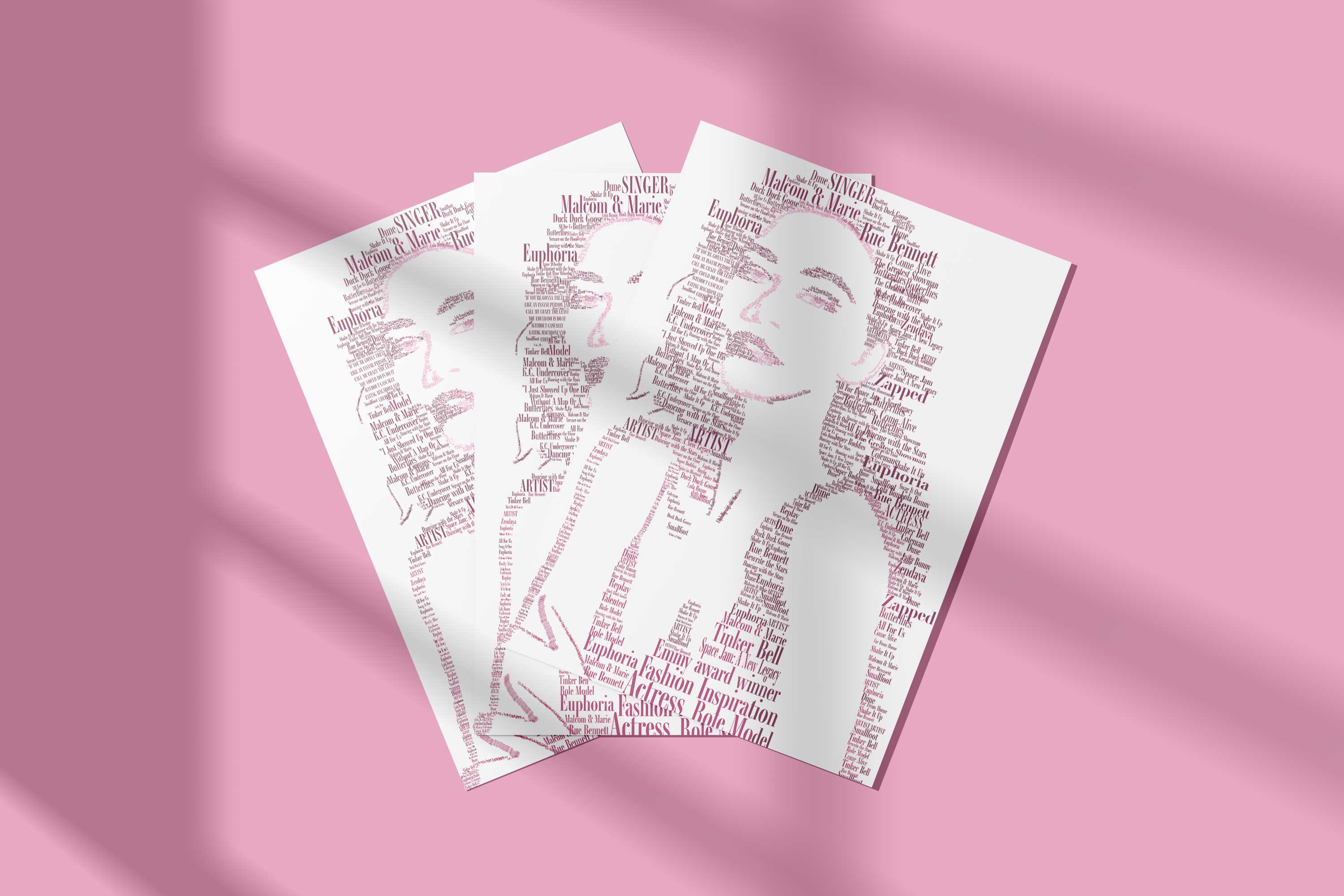
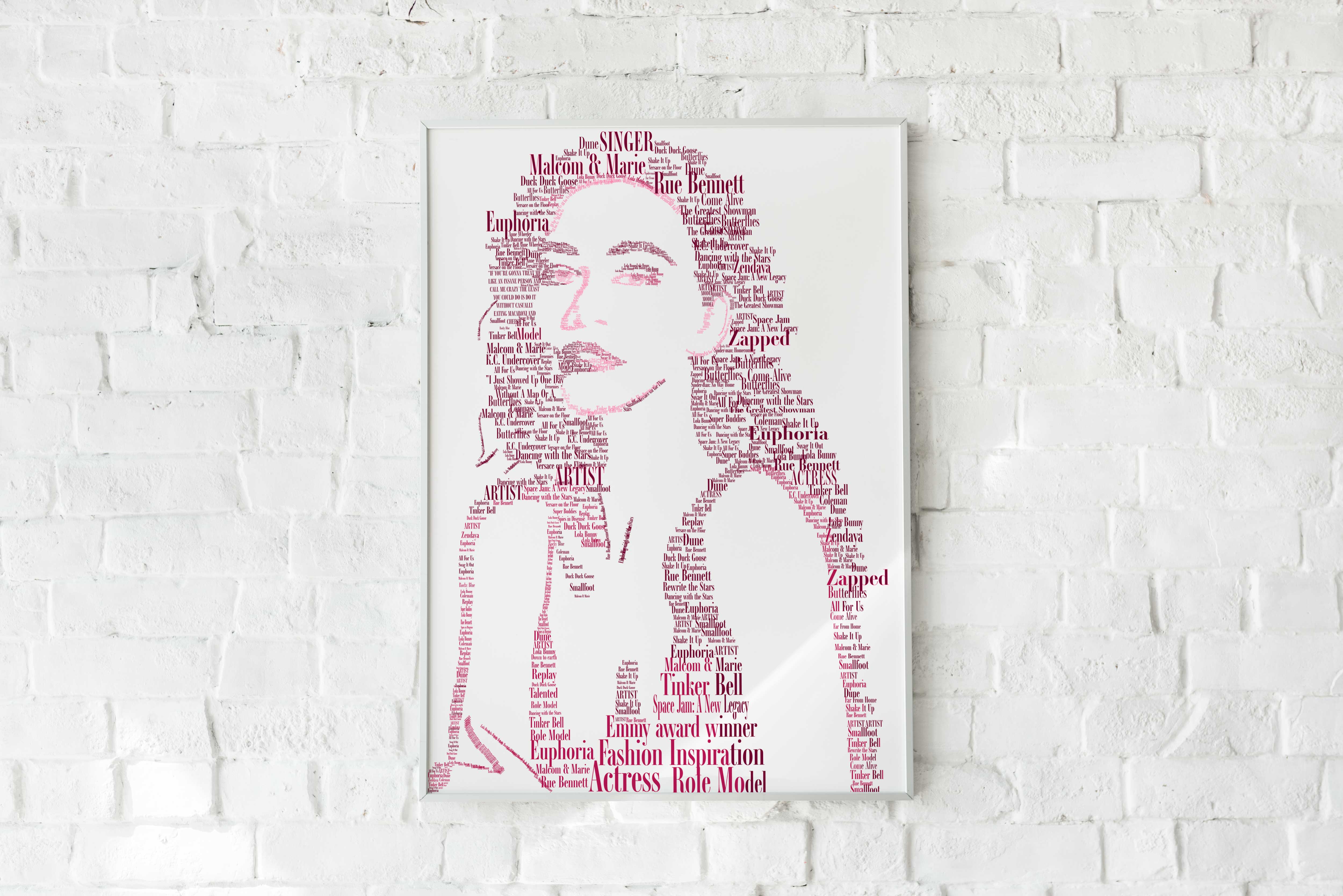
The main elements and principles of design that I employed here were value, color, proportion, white space, and repetition to create this typographical portrait of Zendaya. My ability to accurately make text look like Zendaya demonstrates not only my knowledge of design but my skills as an artist. I also think the ability to utilize white space and value to create highlights to show features and the overall essence of a person, and my use of color to create a certain mood demonstrates my knowledge and skill.

Originality
This project was one of the more simple ones, in regards to the design process. My brainstorming for this project included just looking at different typography posters of celebrities and figuring out what font and colors I though thought best represented Zendaya. Being that this is a typography poster, the font is the star and it had to make sense with the celebrity’s personality and/or their body of work, so I took my time trying to find the perfect font that represented Zendaya. I also took my time and did research on color meanings to pick what color I wanted to represent her best. I think that the efforts to produce something creative and original are evident in this project. It is kind of hard to be super original in this type of project because they all look similar as it is text creating an image. The creativity and originality lie in the font you choose and how you decide to position each word, and I think to make my typography poster feel different than the other posters I’ve seen, I succeeded.
Evidence of Following Directions
The directions and specifications for this project were to choose a celebrity to do your poster on and then choose a font, and colors, and include words that you think would represent their personality and/or their body of work. I did just that, I chose a font that I thought represented Zendaya’s “modelesque” figure and her young, yet classy demeanor. I then researched colors to choose a color that also would display the same vibes. I always make sure to read and re-read the rubric to make sure I included everything I was supposed to. As for revising it to include in my portfolio, I didn’t find it necessary to change the intent of the original direction, as I am happy with the font choice and color and I think they represent Zendaya accurately. The only thing I changed was some of the positionings of the words to fix the proportions of her face and make her resemble Zendaya more.
Back