Elements of Design
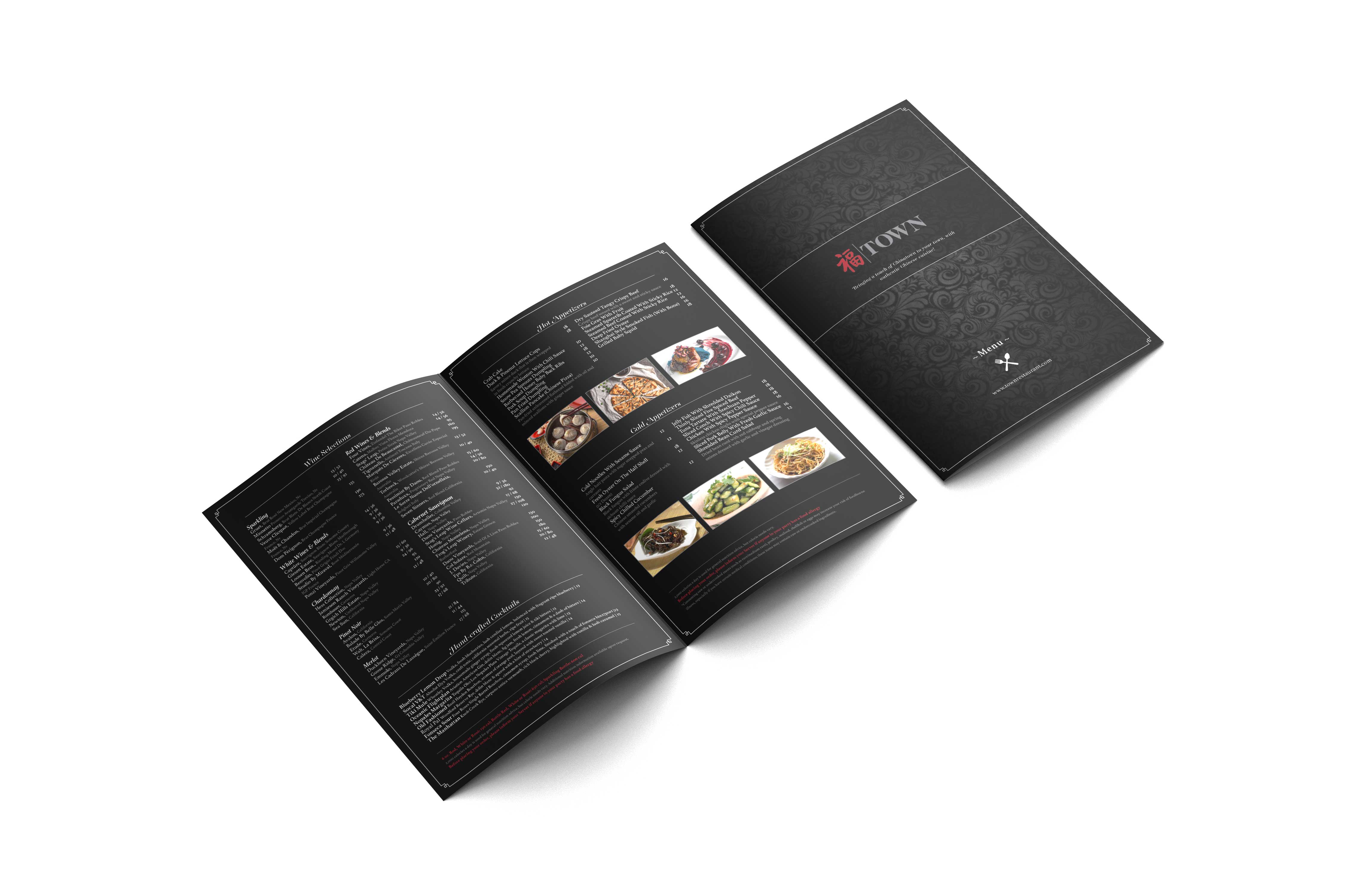
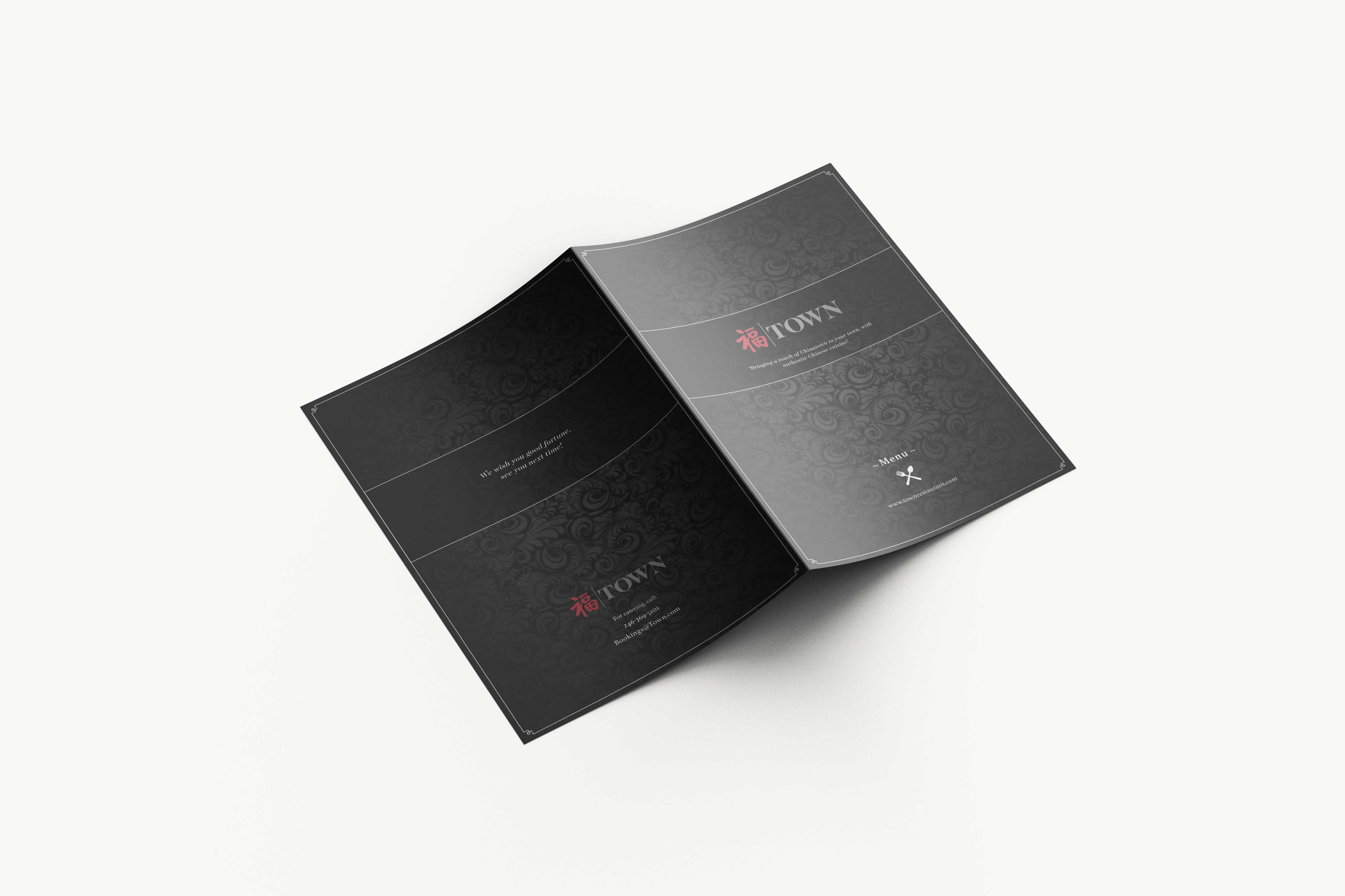
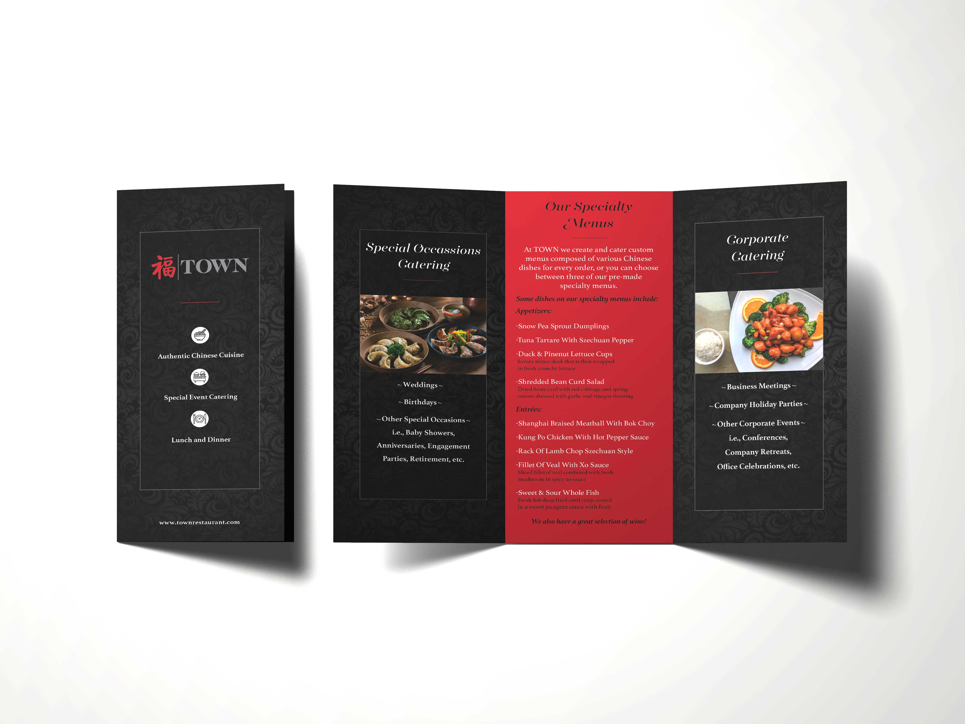
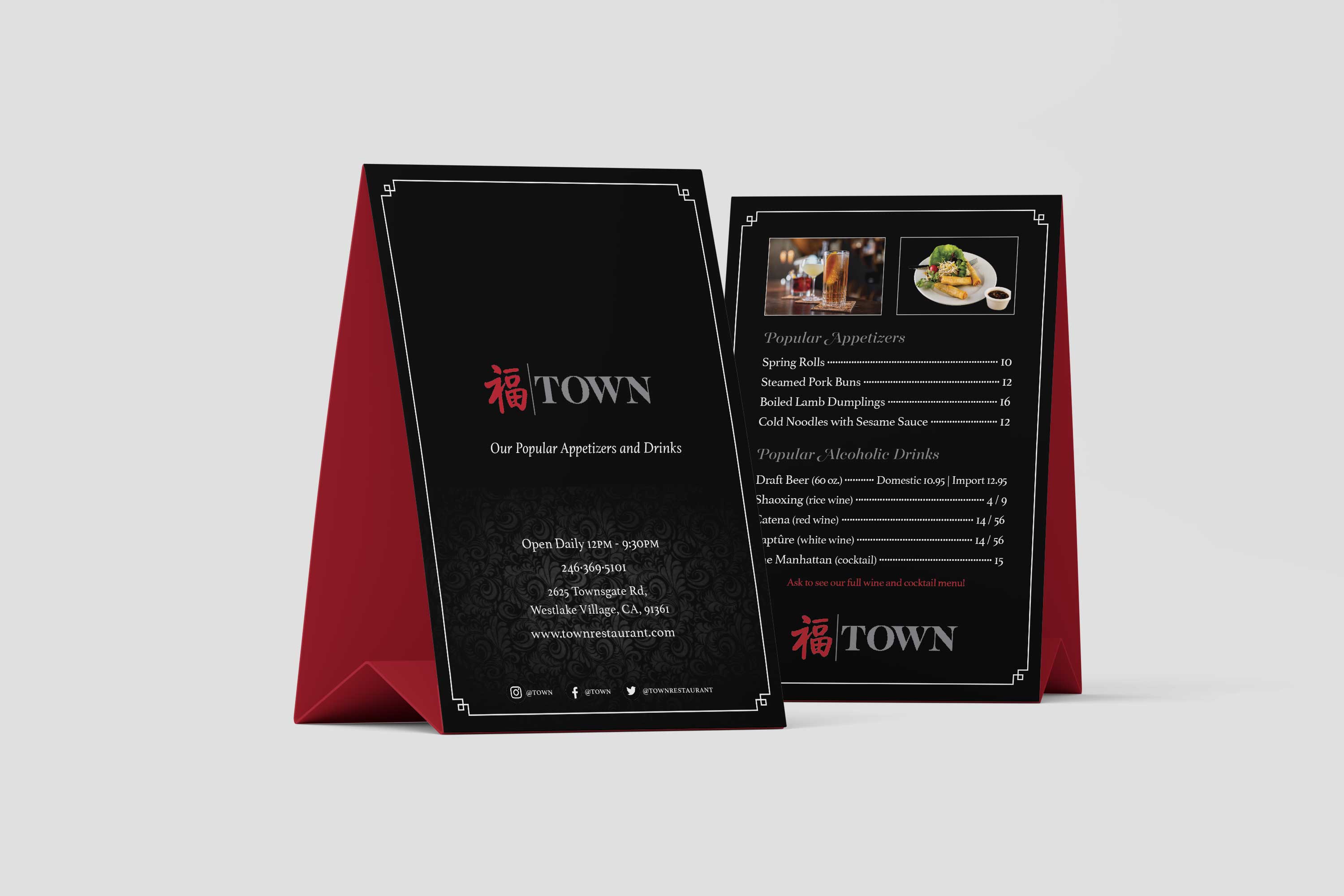
Being that this project was text heavy and more about layout, there weren’t many graphics being used nor did many of the elements and the principles of designs have to be used in a complicated way. The main elements and principles of design used were contrast, pattern, and texture. The background of all of the pieces are black and the accents are red, white, and grey; allowing the food images to stand out. And then the ornamental background I used adds depth and a sense of pattern and texture. I think the intentional use of contrast and color shows my skill and depth of knowledge.

Craftsmanship
I think the overall design looks professional and the quality/resolution is the highest it can be. I made sure that all of the text was readable, and because this project is for print, I made sure to use CMYK to ensure color accuracy when it is printed. And I gave them a bleed of 0.125 so that when they are ready to be printed there would be no white left showing on the edges.

Originality
This project took a lot of time and brainstorming to get to the finished project. I already had an idea of what I wanted everything to look and feel like when I read the mission and vision statements in the style guide, so it didn’t take much time to know what direction I wanted to go. It was the layout and finding all of the food and drinks I wanted to include, that took a lot of time and brainstorming.
I knew I wanted the menu, brochure, and table tent to portray luxury and fine dining, which is why I chose black as the main color and red to be the secondary color, and why I chose the ornamental pattern to add a more luxurious feel. I think my efforts towards creativity and originality are apparent in the finished product, as I feel like these pieces look nothing like anything else.
Because this is a Chinese restaurant, I wanted to make sure it gave that vibe and the theme was apparent, without being gimmicky or stereotypical. I think I showed the Chinese theme that they were going for in a tasteful way that shows my knowledge of ethical guidelines. I made sure to keep my images geared towards the food and if I did include an image other than food it would be an architectural image, I didn’t want it to include people and I made sure that the images were accurate to Chinese culture specifically. I wanted to make sure this project would be well received and not bring offense to anyone.

Evidence of Following Directions
For this project we had to create stationary/promotional pieces—menu., brochure, table tent—for a new Chinese restaurant. Their mission/vision was to bring Chinese cuisine to the area in a luxurious/high-end way. With that being said, I think I adhered to all of the specifications given, as I stuck to the style guide provided and I created a print-ready menu, table tent, and brochure.
Back