Elements of Design
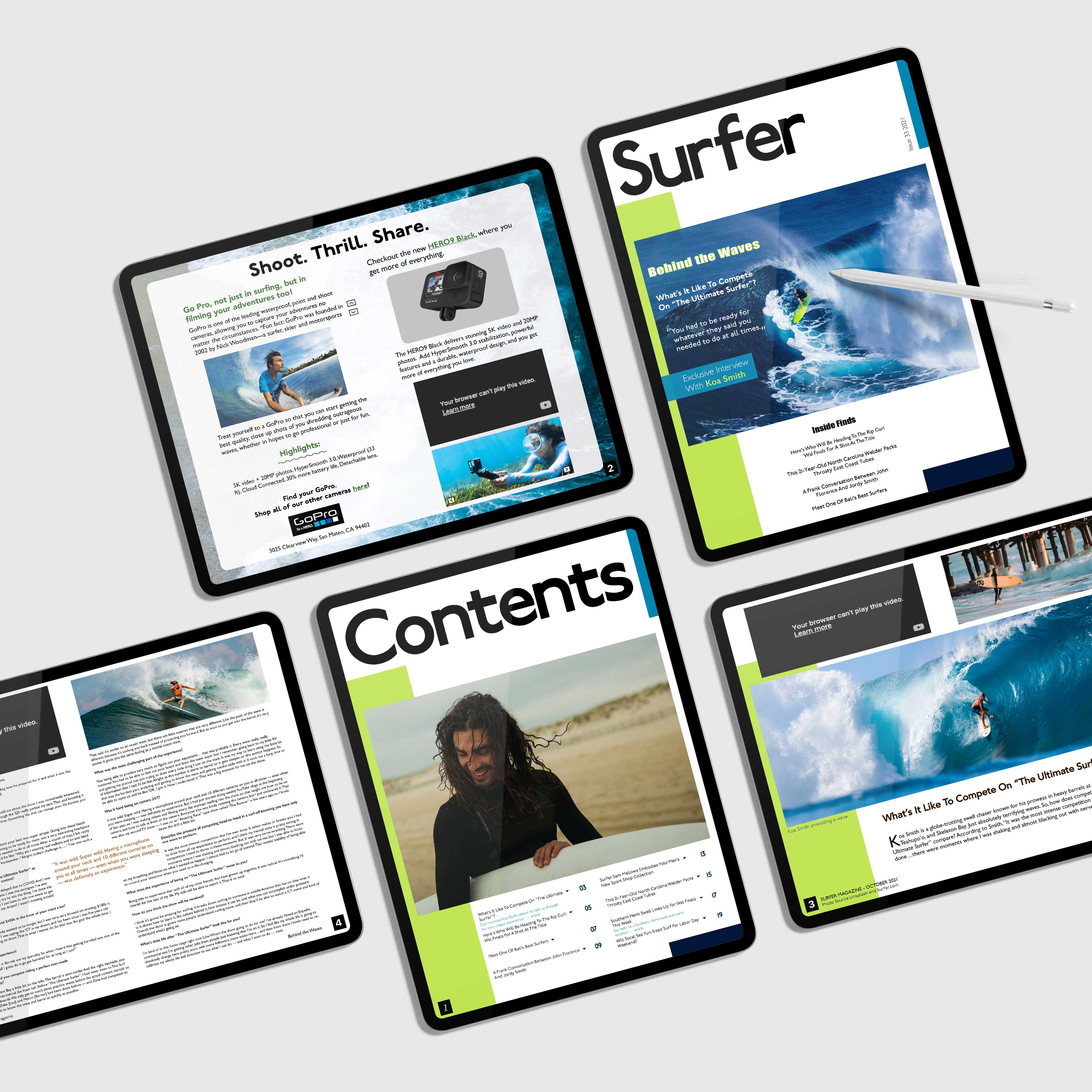
Being that this is a magazine most of the design work had to do with layout, I think this project demonstrates my knowledge and understanding of how to utilize shape, white space, contrast, balance, repetition, and movement. The intentional placement of the rectangles, the images, and the texts I feel show that I understand the elements and principles of design. Being that this magazine is a Surfer magazine, I wanted to make sure that the decorative designs and the font gave off a surfer/beachy vibe; so, I chose blue and green, as they complimented the image I used on the cover. And to create some depth and give some pops of color, while utilizing white space, I used small rectangles and strategically placed them where it made the design feel balanced.

Originality
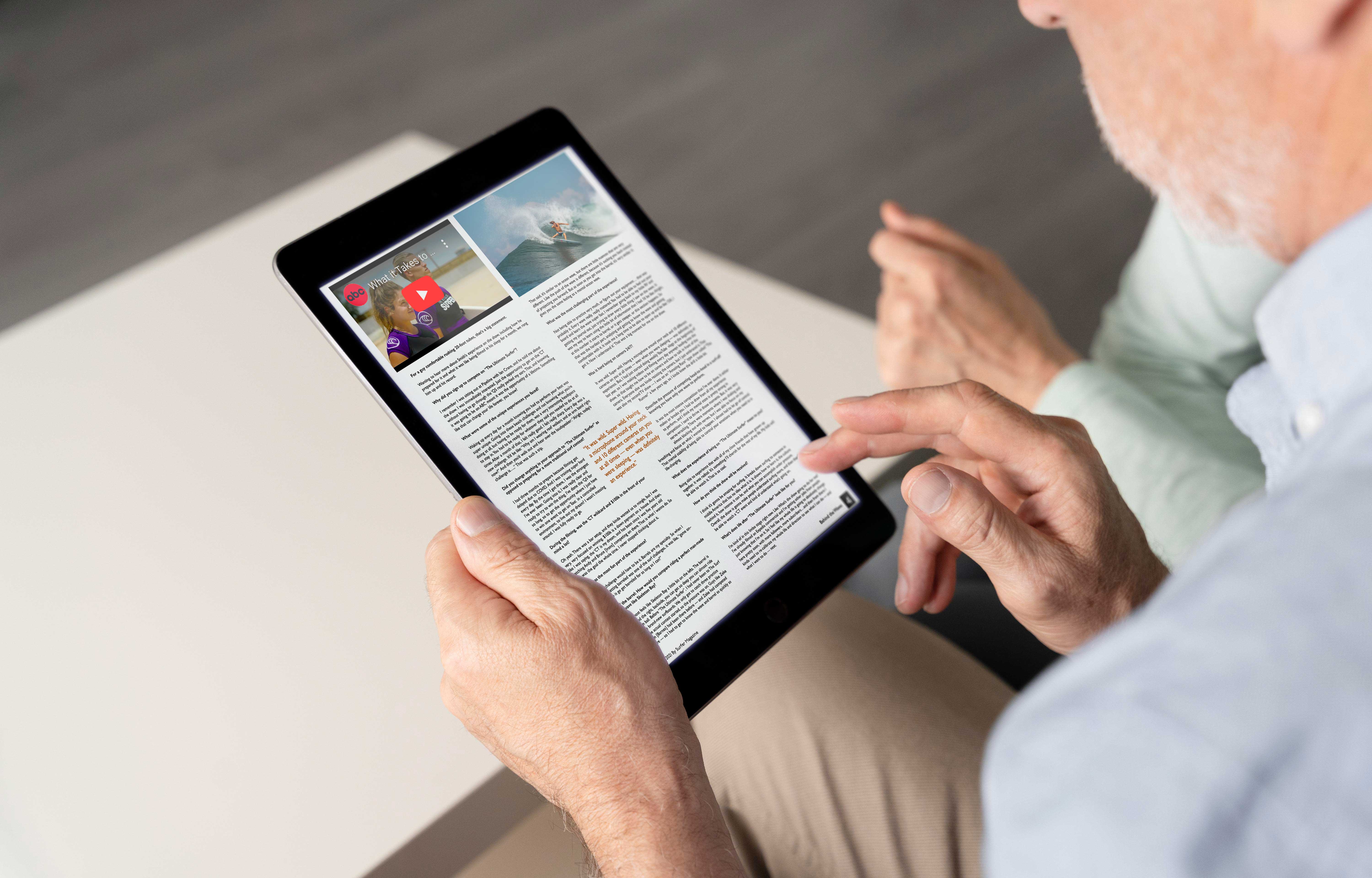
This was one of the bigger, more extensive projects I think I’ve had to do. The design process for this project included first picking a topic—which took some research within itself—doing a lot of research and analysis of other interactive digital magazines and then sketching a wireframe that laid out what we wanted our magazine to like in both vertical and horizontal orientations. Everything that I wanted to include (interactive elements, colors, types of images, etc.) in the magazine was laid out in the wireframes
This project had a lot of different parts to it, so I had to spend more than a few hours a day to work on it and make sure it would be done on time. I think the amount of time spent in the design process and spent brainstorming for this project allowed for the finished product to look as put together and professional as it does. I think my efforts put into the design process to create an original and creative design are evident in the finished product. I don’t think this design resembles any other design and it stands out against all of the other Surfer magazines.
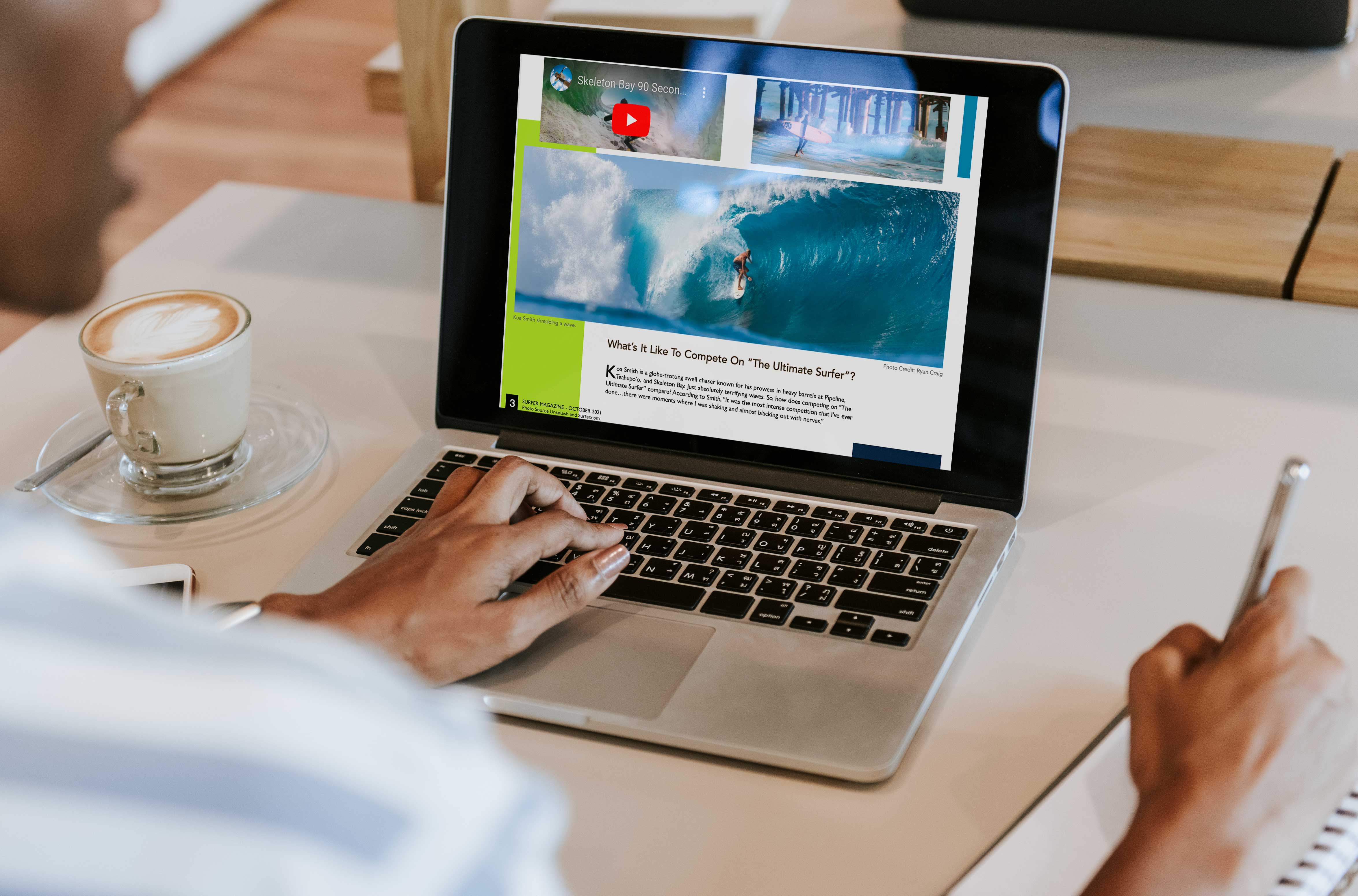
As for ethical guidelines, with this specific project, being that this is a magazine and there were many images included; I made sure to credit and state where the images were sourced from at the bottom left of page 3 and under one of the larger pictures I specified who the actual photographer was. I don’t ever want to take credit or even leave room for people to think any work is mine that isn’t, because I know how frustrating and disheartening it can be to have somebody using your work as their own and getting praise for it.
My thought process behind the design is that I wanted it to feel like a true Surfer magazine from the images, to the color, all the way to the font. When people see it I want them to automatically feel like they’re at the beach too, I want them to imagine the waves and hear the water, so first I picked out the cover image and went from there. I based the colors around the image, I wanted everything to complement one another, so I stuck with blue and green since that was the colors in the picture. I chose to have a limited color palate because I noticed in my research that most surfer magazines are kind of simple and have a chill vibe with not too much going on at one time. So, I wanted to keep that simplicity, I feel like it reflects the chill vibe of surfing and the surfers themselves. They tend to be very simple people that just love to surf, so I didn’t want to add too much where it took away from the only topic, which is surfing.

Evidence of Following Directions
The directions and specifications for this project were to choose a topic and create an interactive digital magazine. It needed to include a 2 page spread article (it could be copied and pasted from an actual article), an ad, and a table of contents. My project displays all of these elements. I made sure to check off every box in the rubric. When revising this project to include it in my portfolio, I did not feel the need to change the intent or original direction. The core of the project I think was perfect, as the magazine communicated the message that I wanted it to, I just needed to tweak some of the decorative elements. I also had to change the main font, because it was no longer available, so I changed it to a similar font that fits even better with the surfer theme.
Back