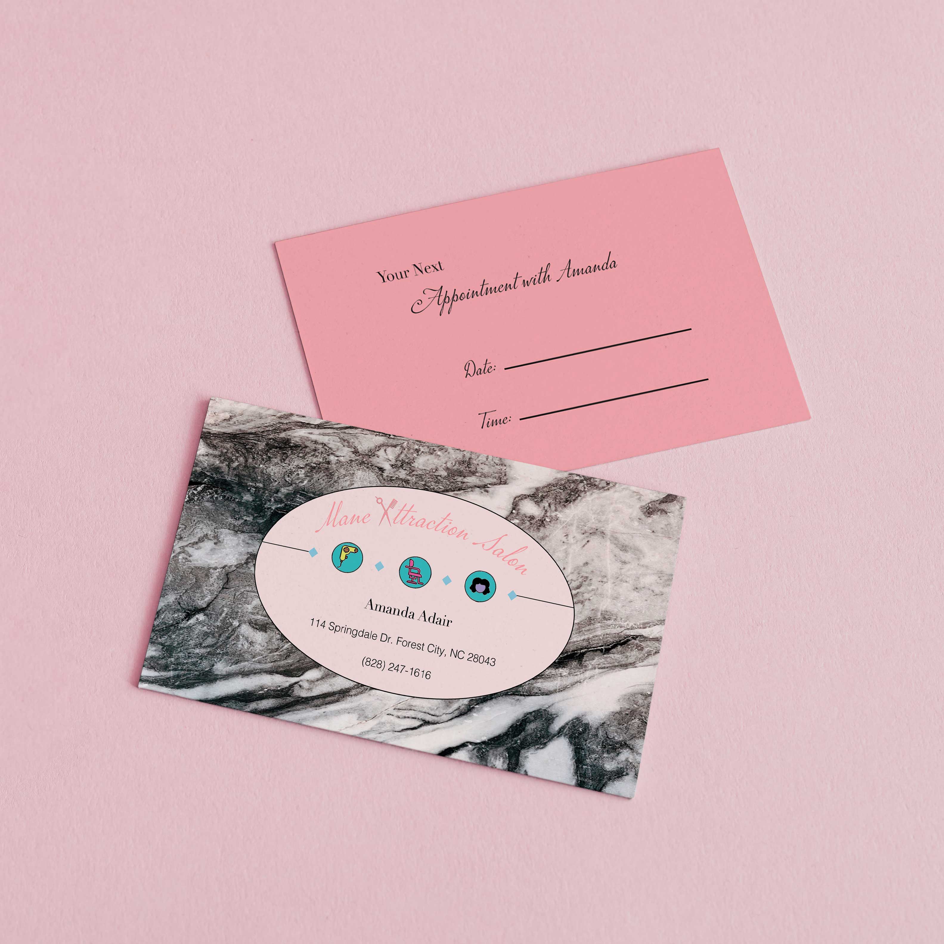
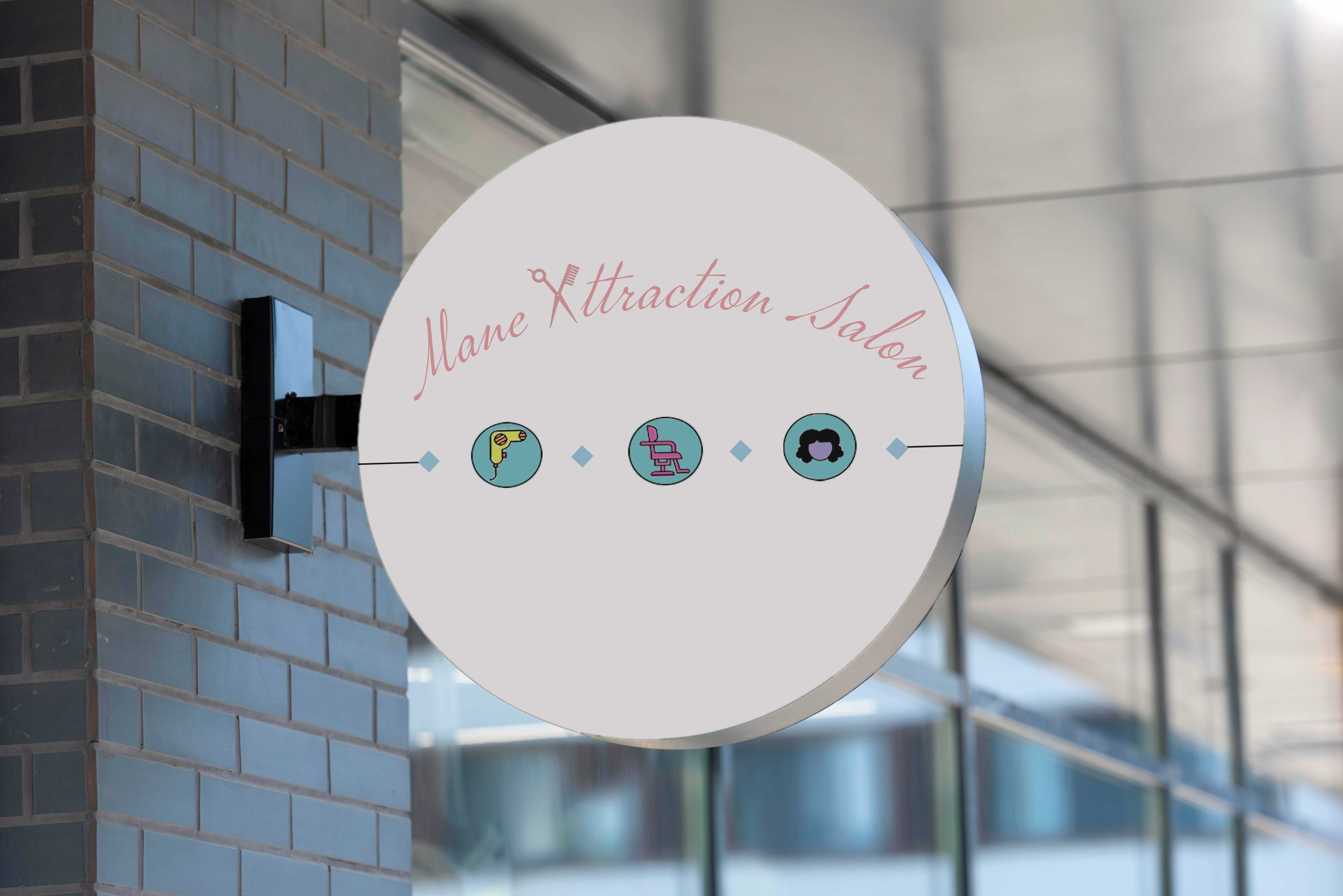
Elements of Design
I used contrast, line, shape, color, and shape in ways that show some skill and depth of knowledge. This is a very simple design, but the use of color in the icons and the light and darker pinks, against the black and white marble, allow the logo and the salon name to stand out and it creates hierarchy. Also, the line and the diamond shapes used to put emphasis on and separate the icons I think show that I do have an understanding of design and how to use the elements and principles of design to create a well-balanced piece.
Craftsmanship
I think the overall design looks professional and the quality/resolution is the highest it can be. I made sure that all of the text was readable, and because this project is for print, I made sure to use CMYK to ensure color accuracy when it is printed.
Originality
For this project, like most of my projects, if I’m not provided with much information or if the person doesn’t know what they want; I will ask them for some of their favorite colors or what colors and style they gravitate towards more, etc. Once I got a little information there, I looked up salon logos and business cards to get an idea of what the hair salon space, in terms of logos, is looking like. Then after that, an idea pops into my head and I just go straight to creating, and then I revise as I go and try different things in-app. With that being said, I do think my efforts of being creative and original are apparent in the finished work. This project isn’t really a project that includes any specifications or graphics where I had to keep in mind ethics. I just made sure everything I used was free to use and didn’t require a license etc. This was a while ago so I can’t remember everything exactly, but I knew that I wanted the logo and business card to look unique, but also elegant and cute; so that was my main thoughts going into developing this design.
Evidence of Following Directions
I wasn’t really given much directions or specifications for this project, in that, it was an outside of school project. Most people that come to me for freelance work aren’t familiar with graphic design or the process that goes into it. They also usually don’t have any set idea of what they want to do, and they just leave it up to me to figure out what their brand should look like etc. Therefore, for this project, the only specification I got was that she was starting her hair business back up and she wanted a nice business card. So, with that information, I created her a logo and a nice business card, so, I do feel like adhered to all given specifications. I did make a few revisions to this project—made some of the graphics bigger, changed the font and the font size, etc.—but I did not find it necessary to deviate from the original directions or intent of the work. I played with some changes, but I like the design the way it is, and I feel like it represents her personality best.
Back