Elements of Design
For this project, I mostly employed balance, emphasis, white space, and contrast to create professional-looking pieces.
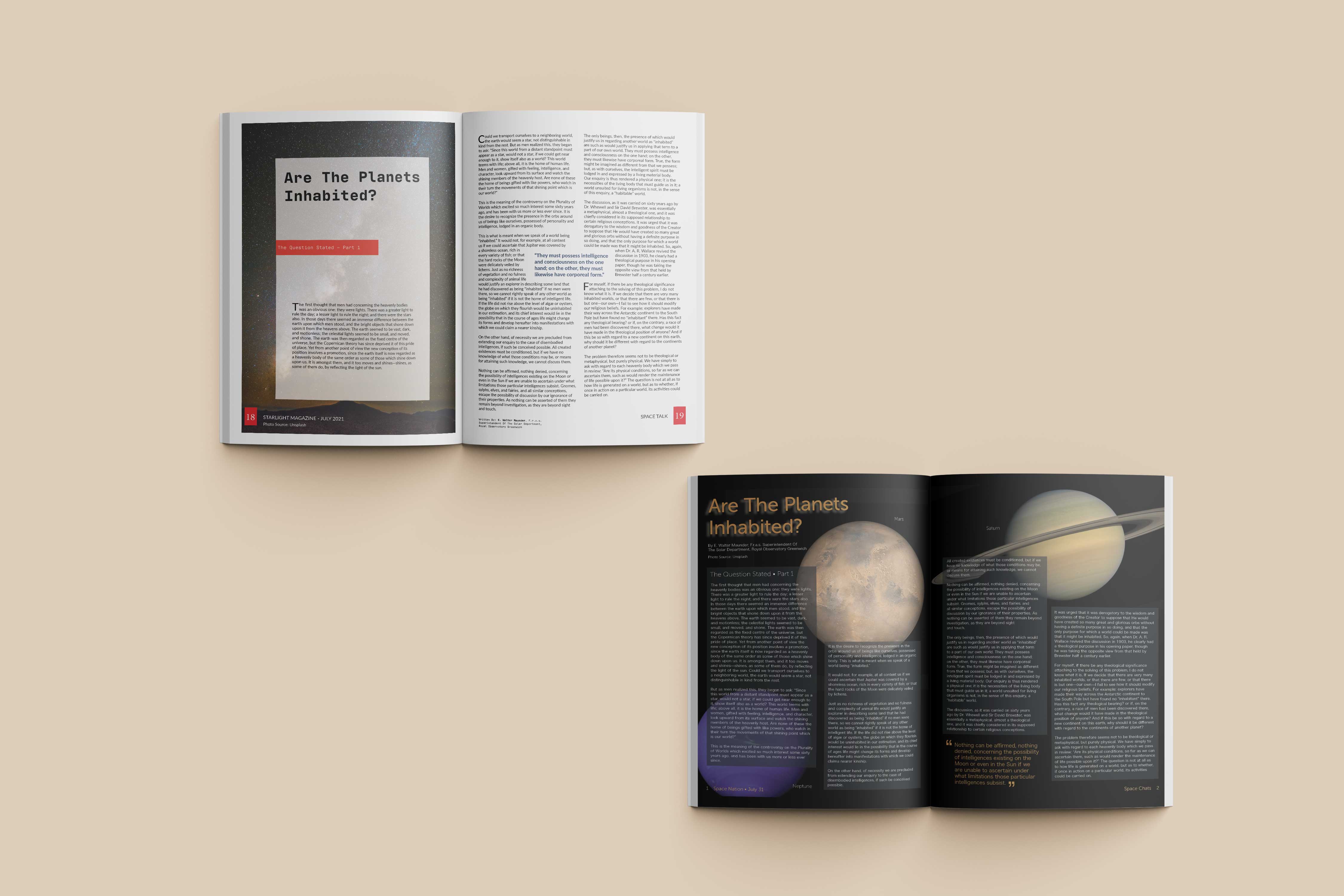
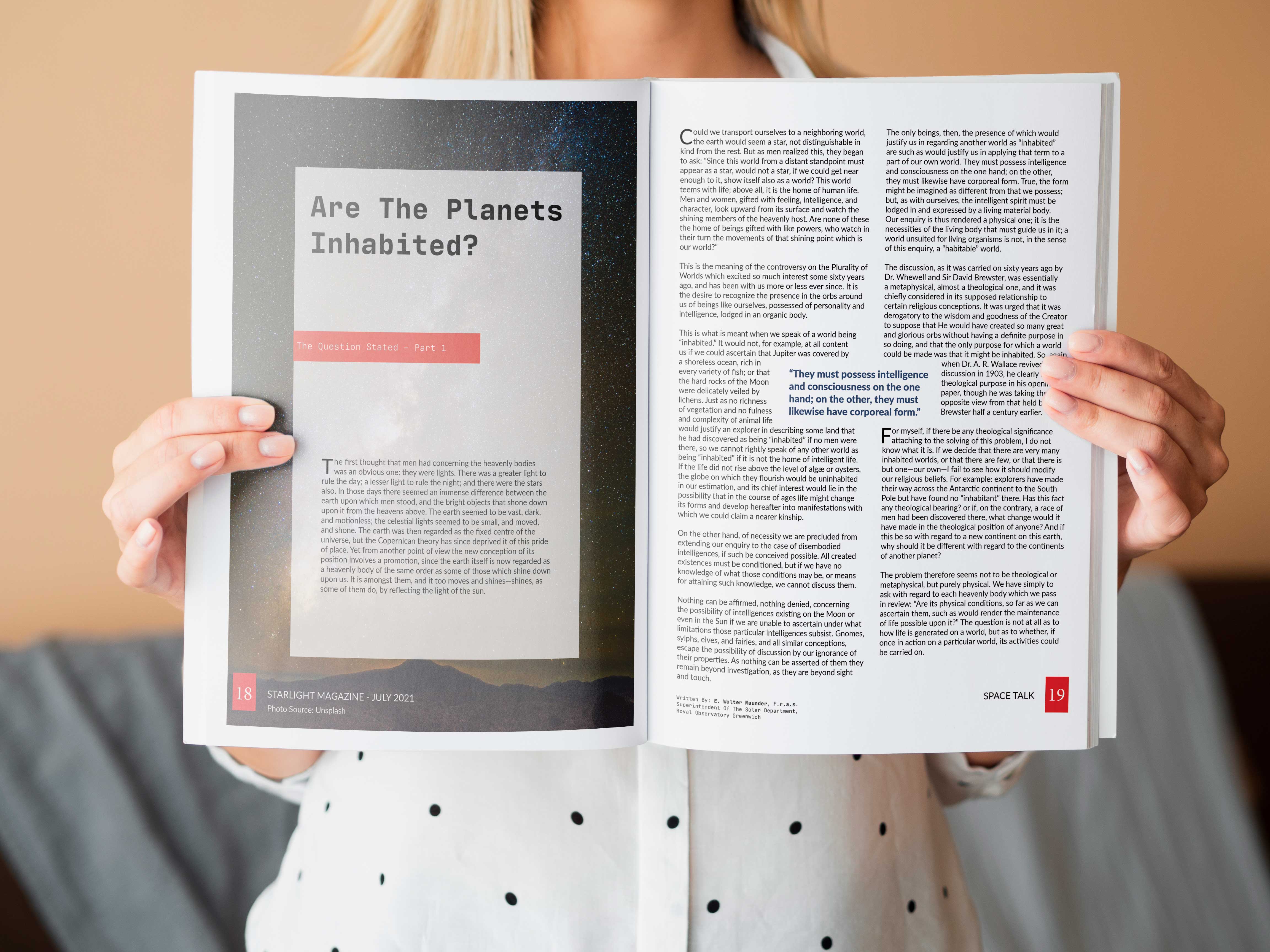
With the first spread, I used contrast and white space to create emphasis and hierarchy. On the left page the dark image stands out against the white space that is the margins, and the red boxes also stand out against the dark image and the white boxes creating effective and well-thought-out contrast. And on the right page, the blue text of the pull-out quote stands out against the white, as does the black text and the red box of the page number.
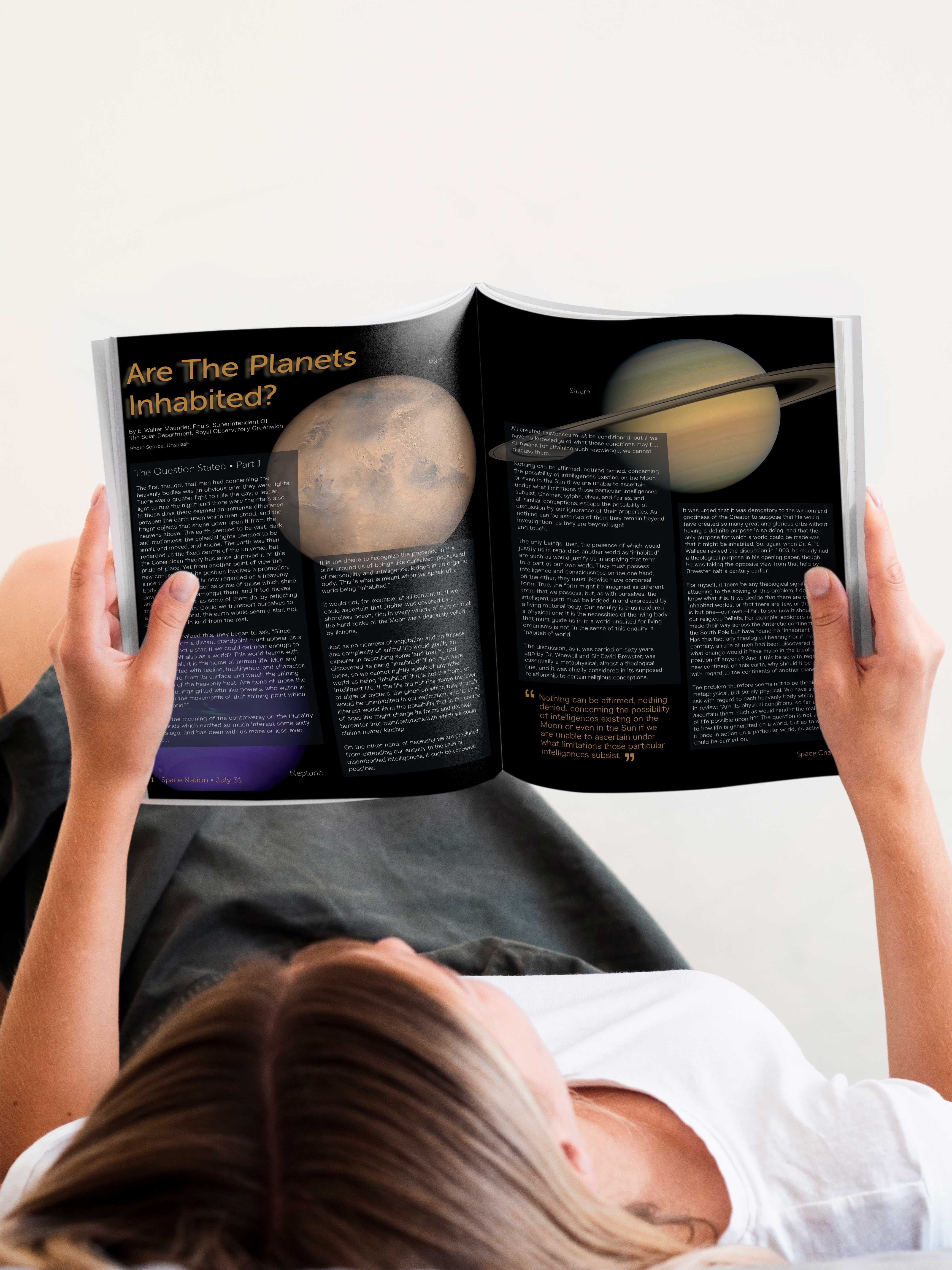
For the other spread, I used a little bit of contrast by having a black background and using yellow text for the title of the article and the pullout quote, white text for the rest of the words, and I put images of some of the planets in the background all to create depth and the feeling of space, how it is a black void and there seems to be the quietness and stillness. I also used the placement of the planets and the yellow text of the title and the pull quote diagonal to it, to create asymmetry and a sense of balance simultaneously. I think all of these choices demonstrate my level of skill and depth of knowledge of design.
Originality
There was a lot of brainstorming that went into this project, I didn’t sketch out any of the ideas, but it took me a lot of time to choose the images and get the layout how I wanted it. The ideas of how I wanted the spreads to look popped into my head rather quickly. The specifications of the project were to create two different spreads that had two different vibes, for lack of a better term, for one article; so my thought was one could be more for a magazine that was geared towards scientists, or a more adult science magazine. This is why it looks more reserved, with a white background and the only image being on the left page of the intro of the article. And then the second one could be for a magazine geared more towards kids or teens, hence why I put images of the planets in the background and why I made the background black. I felt like that would be more appealing to kids and teens. And for both of them, I used pops of color—in the first spread I used blue and red, and for the second one, I used yellow—to add a little contrast and character. I do think my efforts toward creativity and originality are evident in the finished product. With my knowledge of ethical guidelines, I made sure to put the name and credentials of the author and where the images were sourced from in the spreads where they would be seen.
Evidence of Following Directions
The specifications/directions given for this project was to create two different magazine spreads, with different audiences, for the same article. It was also specified that we use InDesign and be creative. I created two different spreads geared towards two different audiences; the first being for adults and scientists, the second being for teens/young adults. I experimented and stepped out of my comfort zone with this project, so I feel like I adhered to all the specifications and directions given. I did make some changes to the black magazine, but I didn’t feel it necessary to deviate from the original directions or intent of the designs.
Back