Elements of Design
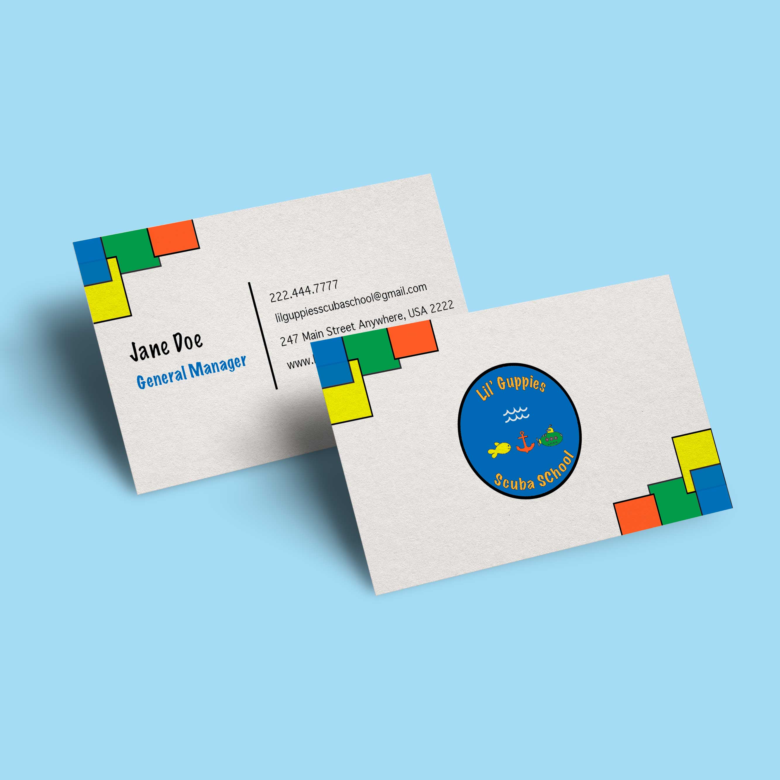
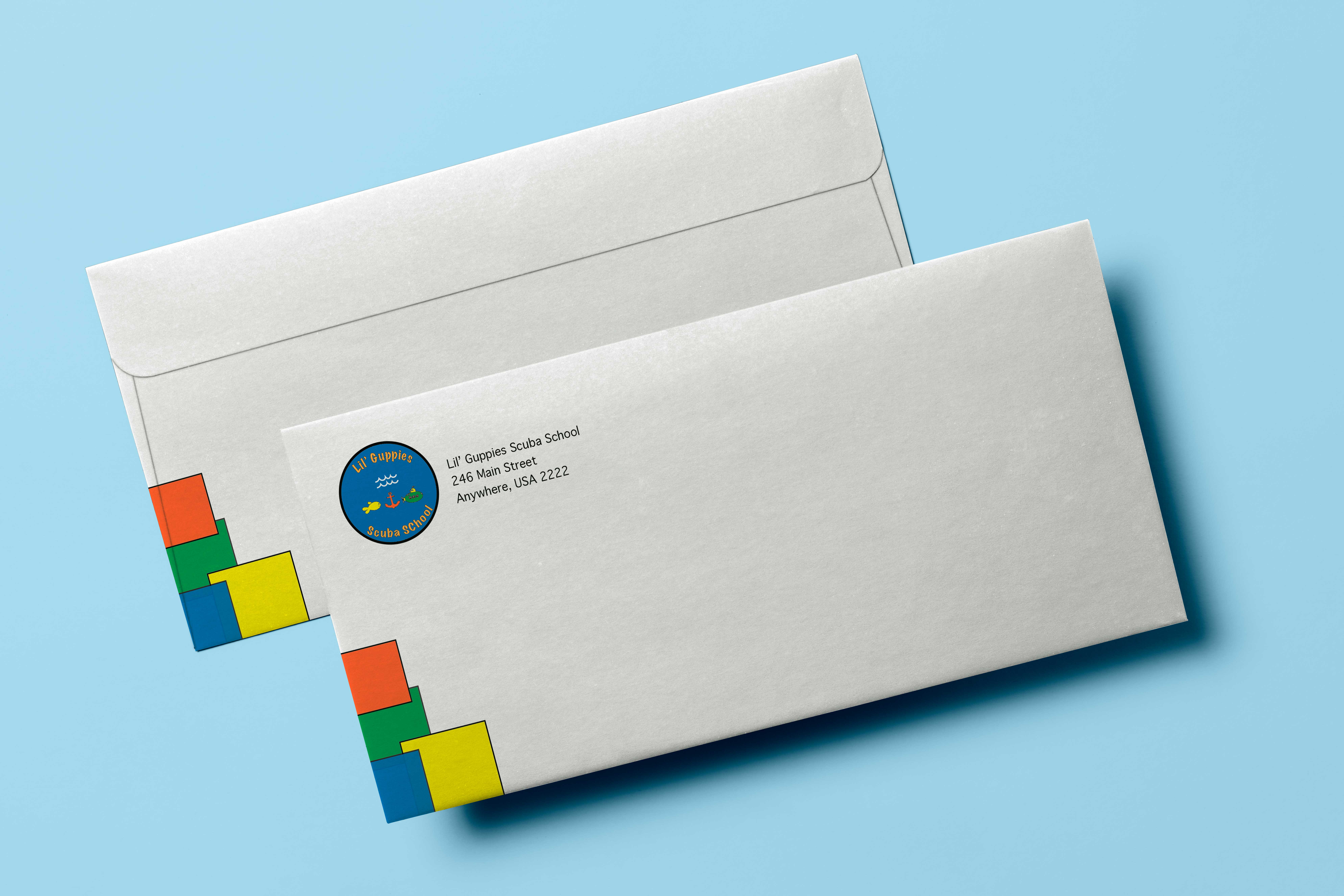
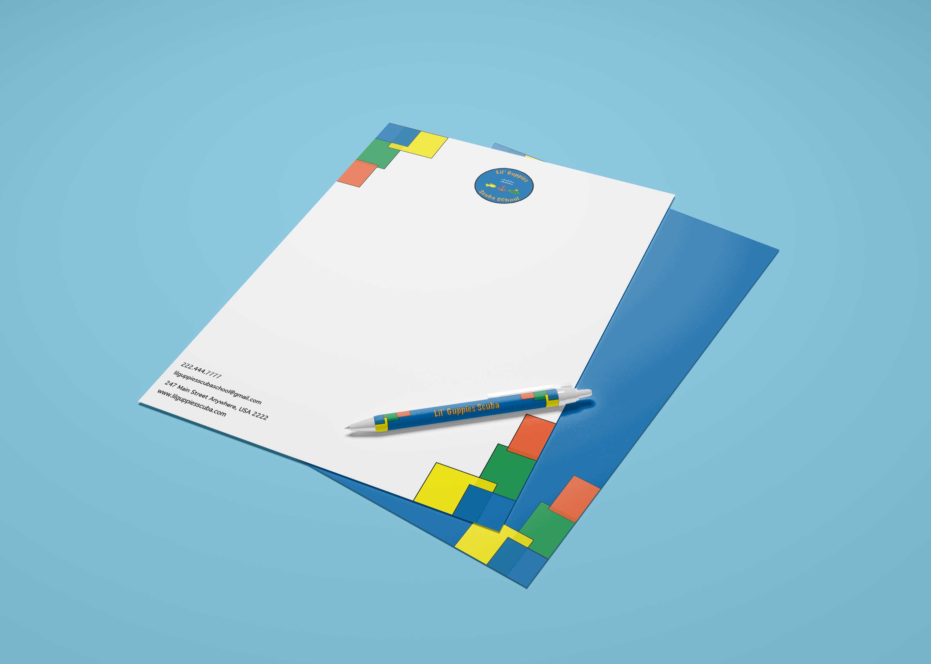
With the logo specifically I use mostly shapes—all of the graphics were made mostly with the shape tool, color—I chose more vibrant colors to communicate that this is a business targeted to kids, and to create a bold logo that is recognizable, and contrast—I used blue and orange as the main colors as they are complementary, and they create a nice contrast. I do think that this project demonstrates my skill and depth of knowledge, mostly with color and the way they work with each other to create a harmonious design. And as for the stationary items themselves, they also demonstrate my skill and depth of knowledge through my use of balance, shape, repetition, and rhythm—the addition of the colorful squares at the bottom and top corners throughout all the designs, and my understanding of layout—the placement of the graphics and text.

Craftsmanship
I made sure that the font used on the logo is readable even when smaller, and I made sure to choose a sans serif font for the text so it would be readable in any format. I made sure to set up the files of the stationary pieces to be print ready; I gave them a bleed of 0.125 so that when they are ready to be printed there would be no white left showing on the edges. I also made ensure to use CMYK to ensure color accuracy when being printed.

Originality
For this project, it took a lot of brainstorming, research, and revisions to get it to the final design. I researched businesses and brands that are geared toward kids to see the colors, graphics, and fonts that were used to get inspiration. I then began sketching out about 10 different logos, I chose my favorite 3, and then I took my favorite parts of each and combined them into the final design you see before you now. Getting to this final design took a lot of time and many revisions.
I think the time and effort I put into this project paid off and I ended up creating original pieces that look unique. The ideation behind the design was simply I wanted to accurately depict the name of the business and I wanted it to not only appeal to parents that this is a credible business that they would feel comfortable with their children going to; but also I wanted it to appeal to the children, where it would catch their eye and they would inquire to their parents about it, and then their parents would want to enroll them in classes there. Furthermore, I wanted it to look professional, i.e., the neat and simplistic overall design and construction of the logo and stationary pieces, while also looking fun, i.e., the bold, vibrant colors; the graphics, and the fun, decorative font.

Evidence of Following Directions
This project required us to create a logo and stationary pieces for a new business for teaching kids to swim. The only directions were to be creative, have fun, and experiment while professionally communicating their brand identity. It might have also been stated in the specifications to use the correct software to create this work. With all of that being said, I did all of this. I let my creativity flow and allowed myself to experiment through my sketches, while also creating designs (logo and stationary pieces) that communicated that their business was targeted toward all kids. Sketching out my design helped me to let go of the fear of not being able to create something because I lack the knowledge of how to fully use the software. And I created this project in Illustrator, which is the appropriate software for this project.
Back