Elements of Design
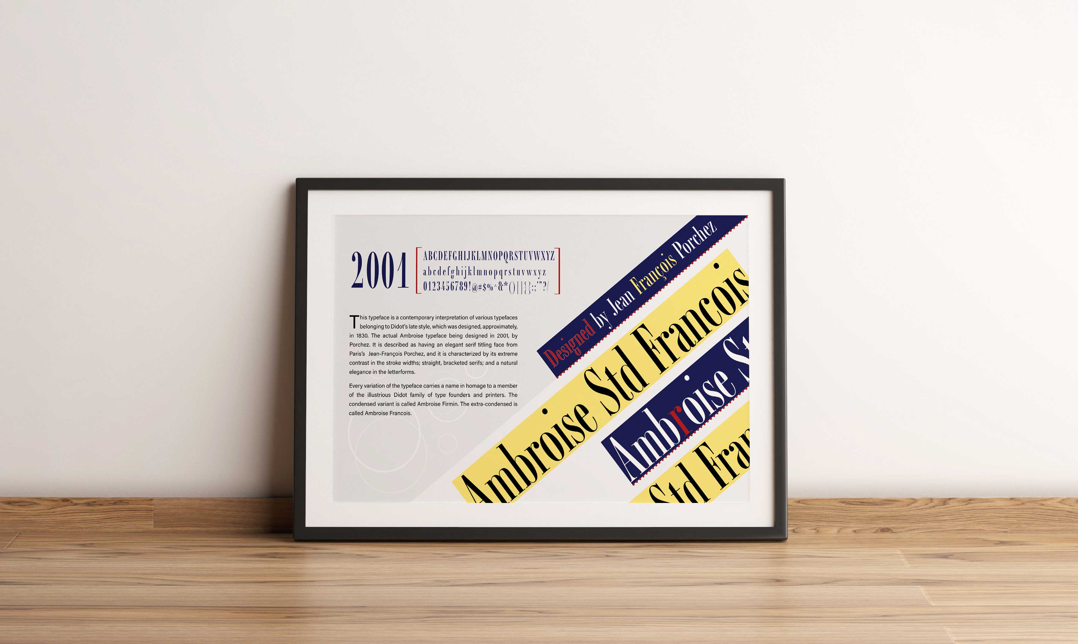
I think this project almost shows all of the elements and principles of design (line, color, shape, form, value, space, texture, contrast, balance, emphasis, movement, white space, proportion, hierarchy, repetition, rhythm, pattern, unity, and variety).
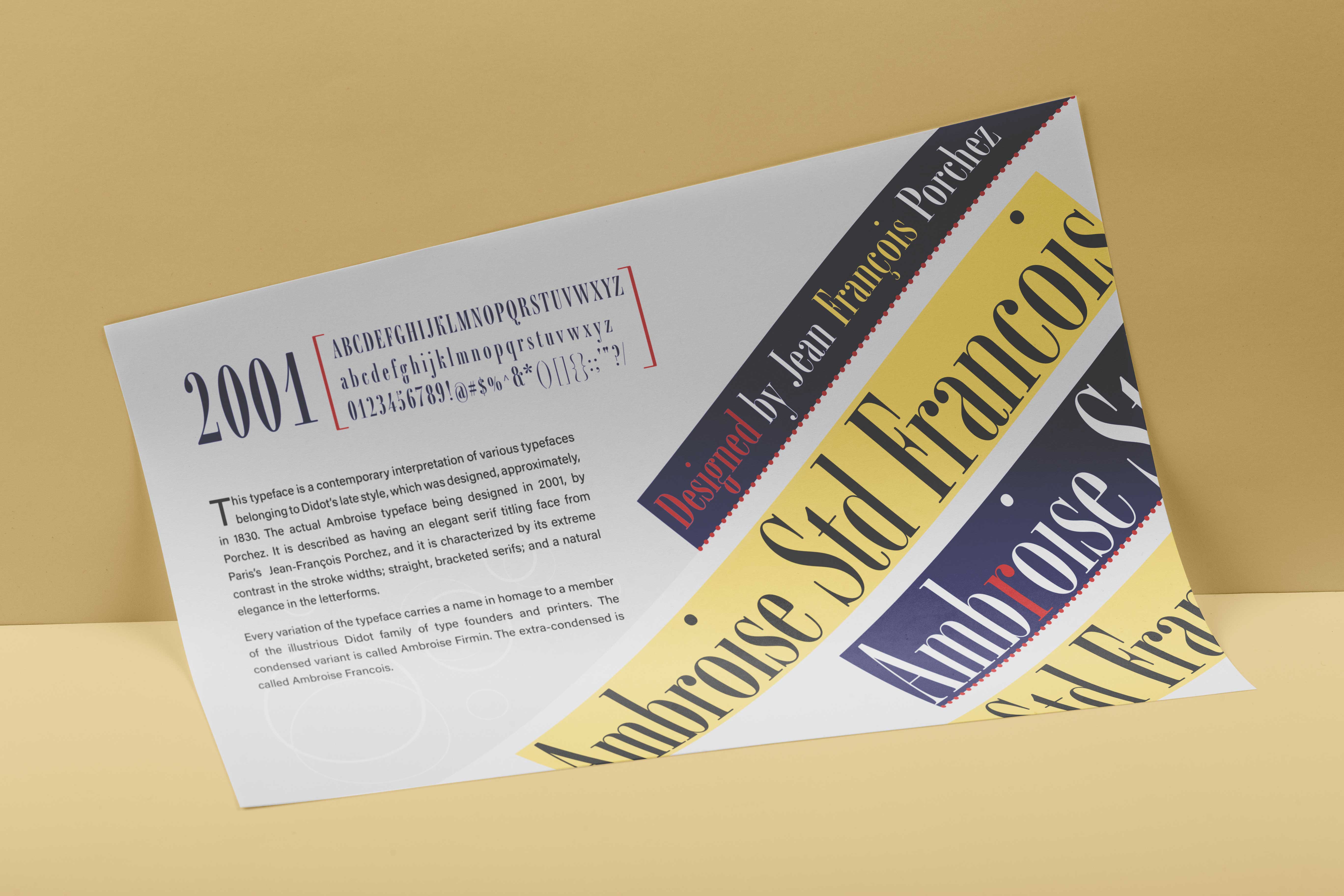
The main part of the poster that has the name of the font displays repetition—the words and the rectangles are repeated, pattern—the alternating blue and yellow rectangles, contrast—the red, blue, and yellow, against the white and gray background, shape—the dots against the blue and yellow rectangles and the thin overlapping white circles, texture—the red dots underlining the blue rectangles creates a sense of texture, emphasis—the red was used specifically to emphasis certain words and letters to give the design some depth and contrast, movement—the diagonal position of the rectangles, white space—the white gaps around the rectangle break up the rich colors and helps create contrast, variety—the red dots along the edge of the blue rectangle I think adds some variety and depth, and hierarchy—I made sure to make the name of the font the main focal point and to let it shine because it is the main topic.
I then had the year in the big blue letters so that the year would be the next thing people notice; I added the red brackets around the “font preview” so that right after the year the eye is pulled there, to almost give a general overview of the font before your eye then makes its way down to the sans serif black text, giving a more in-depth description/history of the font. I think that this use of the elements and principles of design demonstrates skill and depth of knowledge because everything about the design feels intentional.
I think that this design has an intricacy that shows that I understand how these elements of design work together to create a sense of harmony and not conflict. Being able to have so many elements of design being displayed in one project, doesn’t create confusion or a feeling of being overwhelmed, I think shows a pretty good understanding and skill.

Originality
For this project, it took a lot of brainstorming, research, and revisions to get it to the final design. I think the amount of detail and intentional design choices (color, contrast, placement, shapes used, etc.) show that my efforts towards creativity and originality are evident. With this project, I knew I wanted it to have a modern, but eccentric feel to it; and I wanted the design to mirror the style of the font. The font is kind of classy, sleek, and fun, but also has a sense of “conservativeness” (if that makes sense), which is how I tried to make my design look as well. I did a lot of research on font posters to see how conservative or out-of-the-box they could get and to get some inspiration. As I didn’t realize that these types of posters existed. So, I went from there and got to creating. I did my creating mostly just “in-app,” and I revised as went.
Evidence of Following Directions
The directions were to use the font we chose for our typography poster and create a font poster; we had to include a brief histroy of the font, be creative, experiment, and use the appropriate software to create the project. All of my ideas came from me experimenting and letting my ideas flow, to create a unique and original design that resembled no other designs; and I used InDesign which I felt was the best software to use for this type of project.
Back