Elements of Design
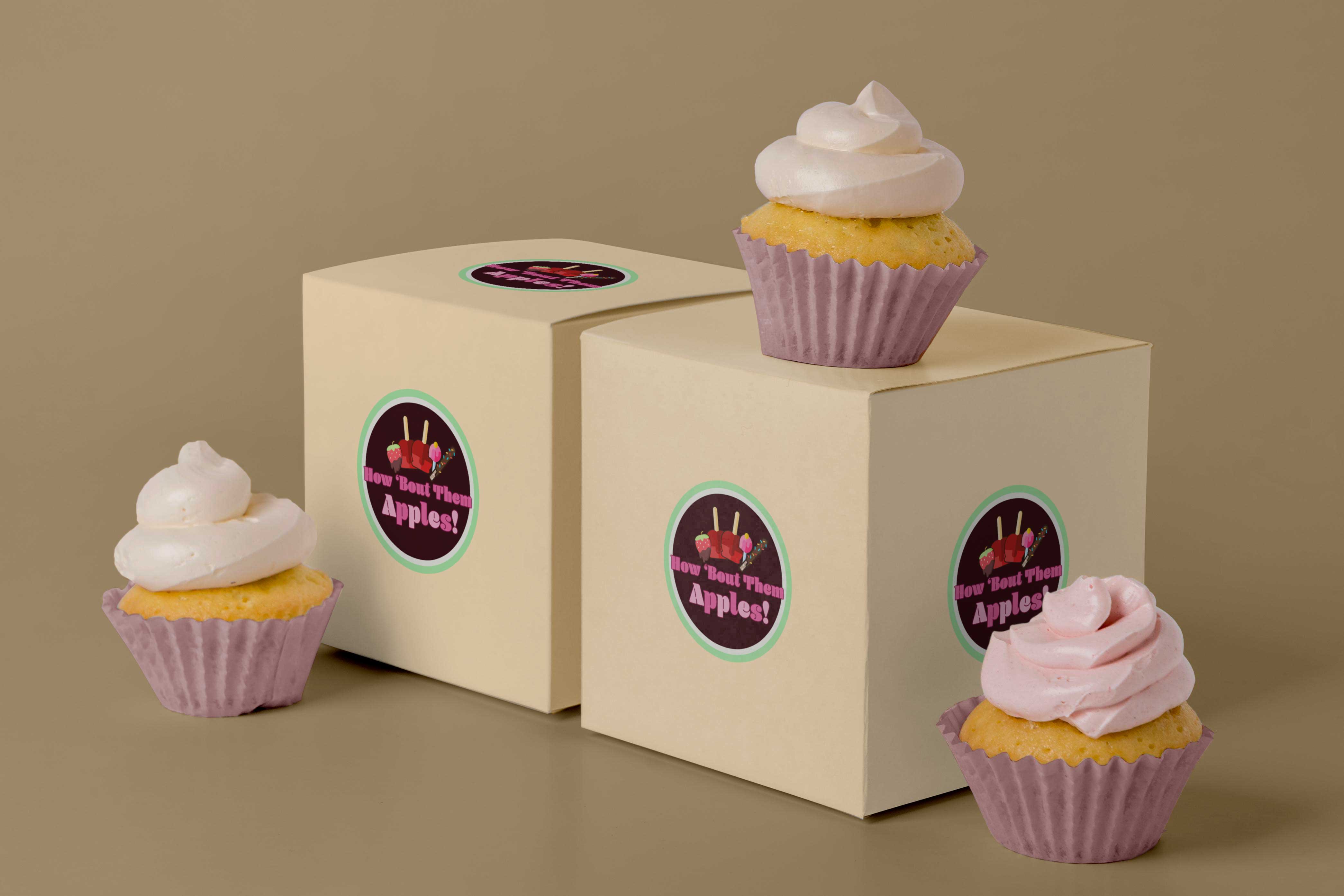
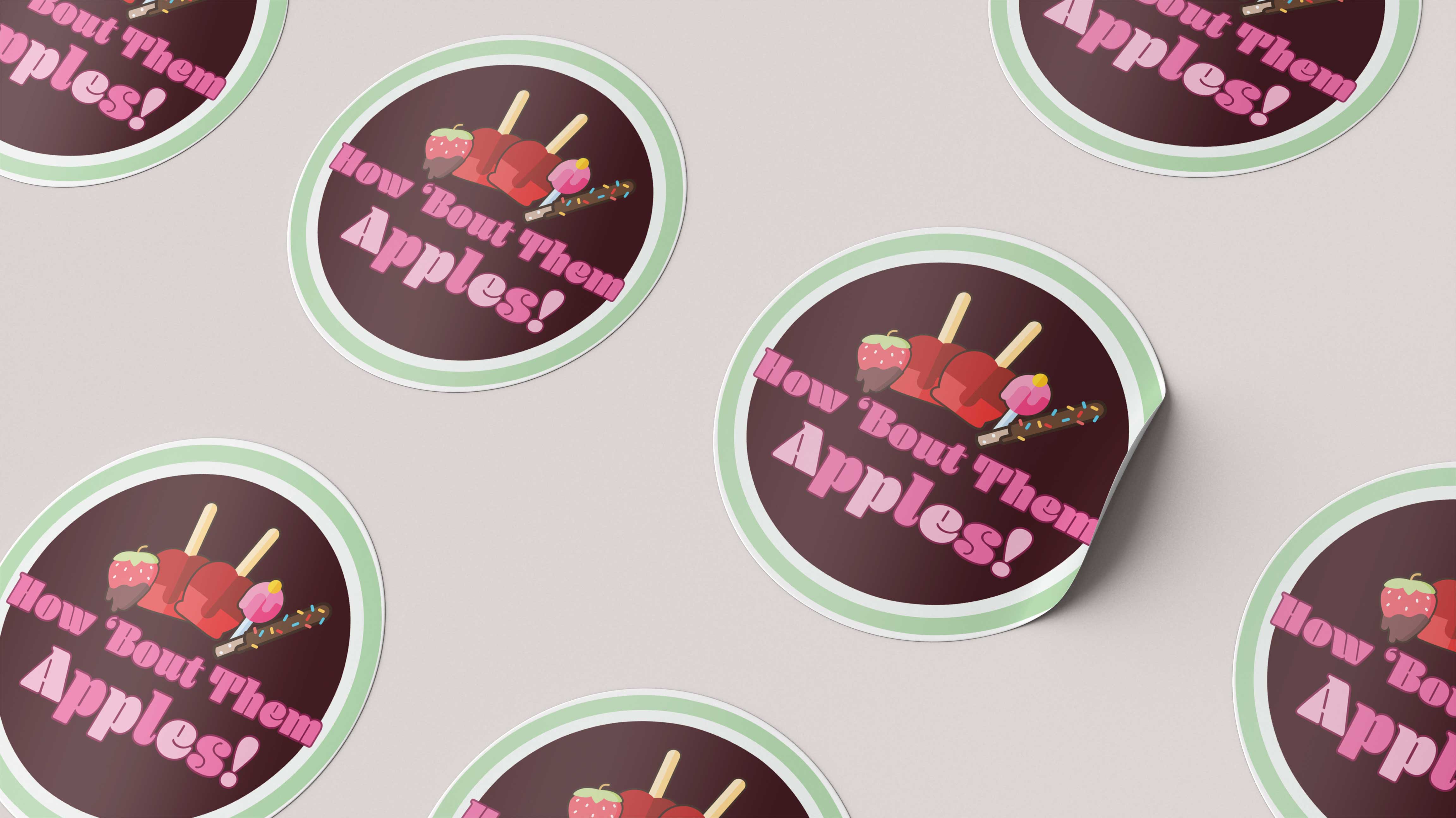
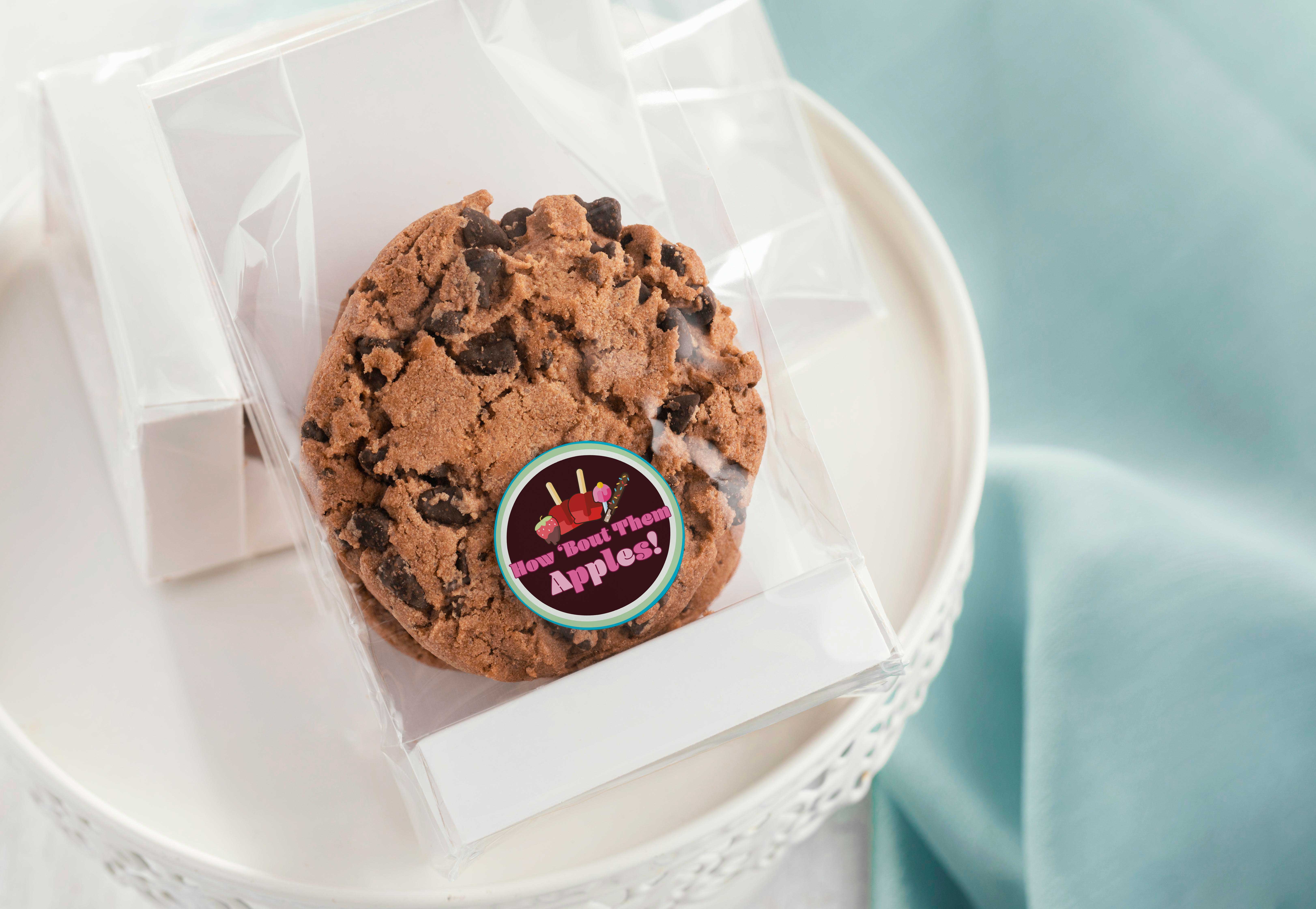
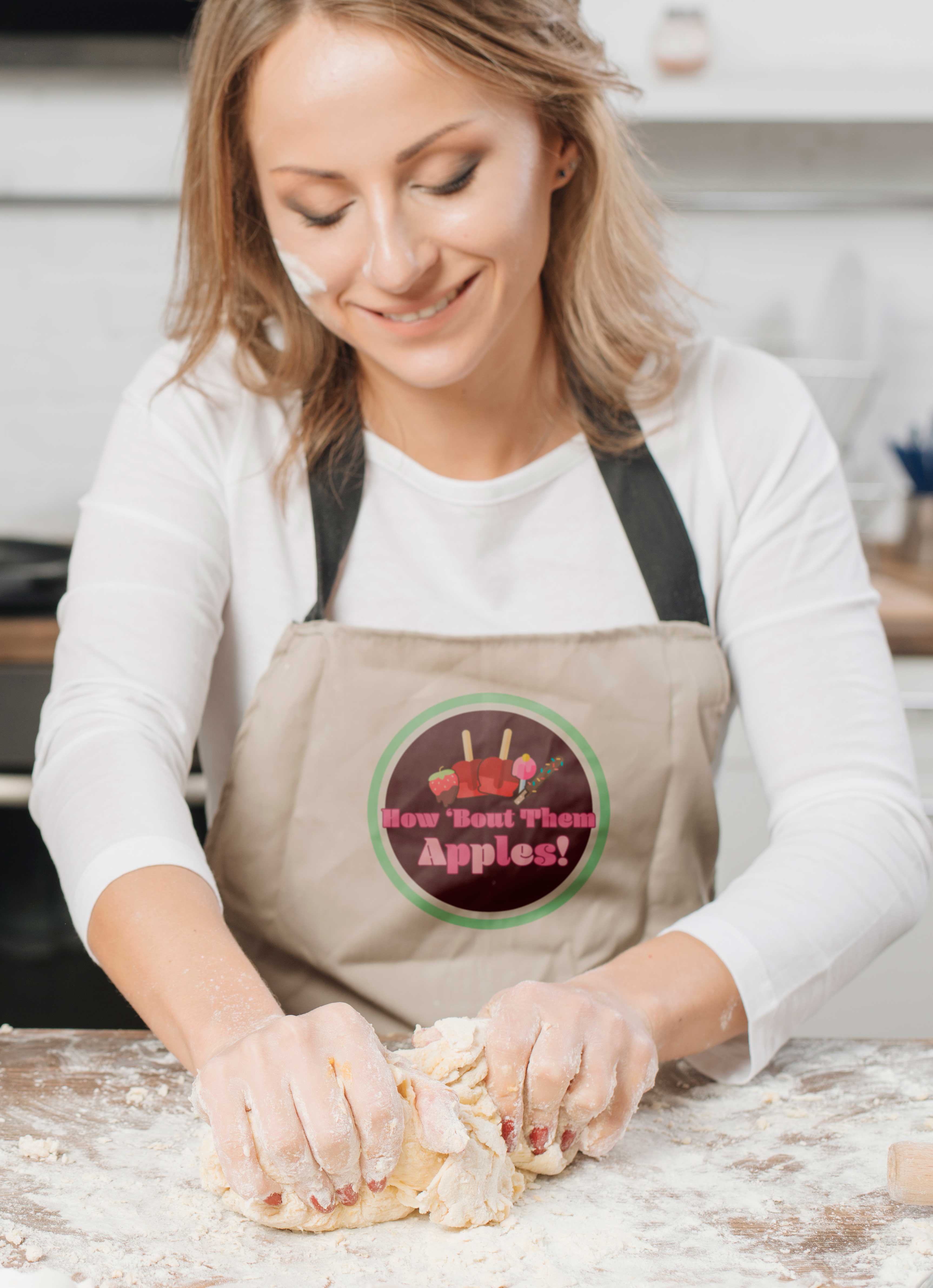
The main thing I wanted to play with here was contrast and color. I wanted it to be vibrant and include many different colors while also feeling balanced and having a clear sense of hierarchy. Because this is a dessert business, I wanted it to be colorful to entice people just like actual sweets do. The colors were green and pink, but a more vibrant green and pink. I like the contrast created with the pink and green, so I kept them but toned them down to a softer pink and green that’s easier on the eyes. I still wanted more contrast and color to balance and almost ground everything, so I chose a chocolate brown.
To keep the logo balanced and not too overwhelming, even though there are a lot of colors and contrast going on, I decided to include sweets that had chocolate on them. I like the “monochromatic,” two-toned look of the chocolate background with the brown chocolate on the strawberry and pretzel. I could’ve made the chocolate white, but I feel like at that point there would have been too many colors and hierarchy would’ve been lost. I felt like all of the vibrant colors needed some softer colors to add another layer of contrast and to help with hierarchy, so I added the light pink color to the word apples. I tried the whole word in light pink, but it felt flat.
I think alternating the darker pink and the light pink created pattern and added much-needed depth. I also thought the double circle broke up some of the colors and gave the logo another layer that added to the whimsical feel of the logo. Lastly, I added the dark fuchsia stroke to the words to create some contrast and help the words stand out from the background. Although a lot is going on in the logo, I feel like every choice made looks intentional, and when it looks like something about the logo is going to be too much, you keep looking and it never gets to that point. It’s right at the brink of “this could be too much,” but because of certain choices made, it’s not.

Craftsmanship
I made sure to choose a whimsical, decorative font that could also be read even if it was scaled down and that was readable both in print and digital formats; I made sure the colors that I chose would show up accurately in both print and digital formats, and I made sure that any graphics or icons I used were vectors based so that they can be scaled without interfering with the quality (although I created the logo in photoshop the graphics I choose were vector images). I made sure that if they were specifically for print I used CMYK and if it was for digital RGB to ensure color accuracy in any format.

Originality
I took into consideration her old logo and the types of sweets she made and I started creating from there. I committed substantial time and effort to create this logo; and it went through many revisions. Whenever I create anything, to get inspiration or to see what other brands that are similar to the one I’m working on look like, I do a lot of research. I don’t ever want anything I create to look generic or the same as what’s already out there, so I looked at other dessert businesses and tried to create something different than what I saw. I think you can see the amount of time, brainstorming, and efforts to be creative and original in the finished product because I feel like it looks different than any of the logos I’ve seen. And it doesn’t remind me of any other brand or business.

Evidence of Following Directions
As stated before, this logo was created for a family friend, and the only request was for me to revamp her logo and make it look more professional, as she had made it herself through an app. So, I had free range. I think I succeeded in revamping her logo and making it look professional. And it represented her brand better, as she didn’t just make candy apples, she made all kinds of sweets; her name was miss leading (she didn’t come to me for branding advice, etc., so I wasn’t going to give unsolicited advice about the name), but I tried to make the logo show what all she offered. Overall, I think this design communicates the brand of the business perfectly; as it’s fun, whimsical, neat, yet still sophisticated.
Back