Elements of Design
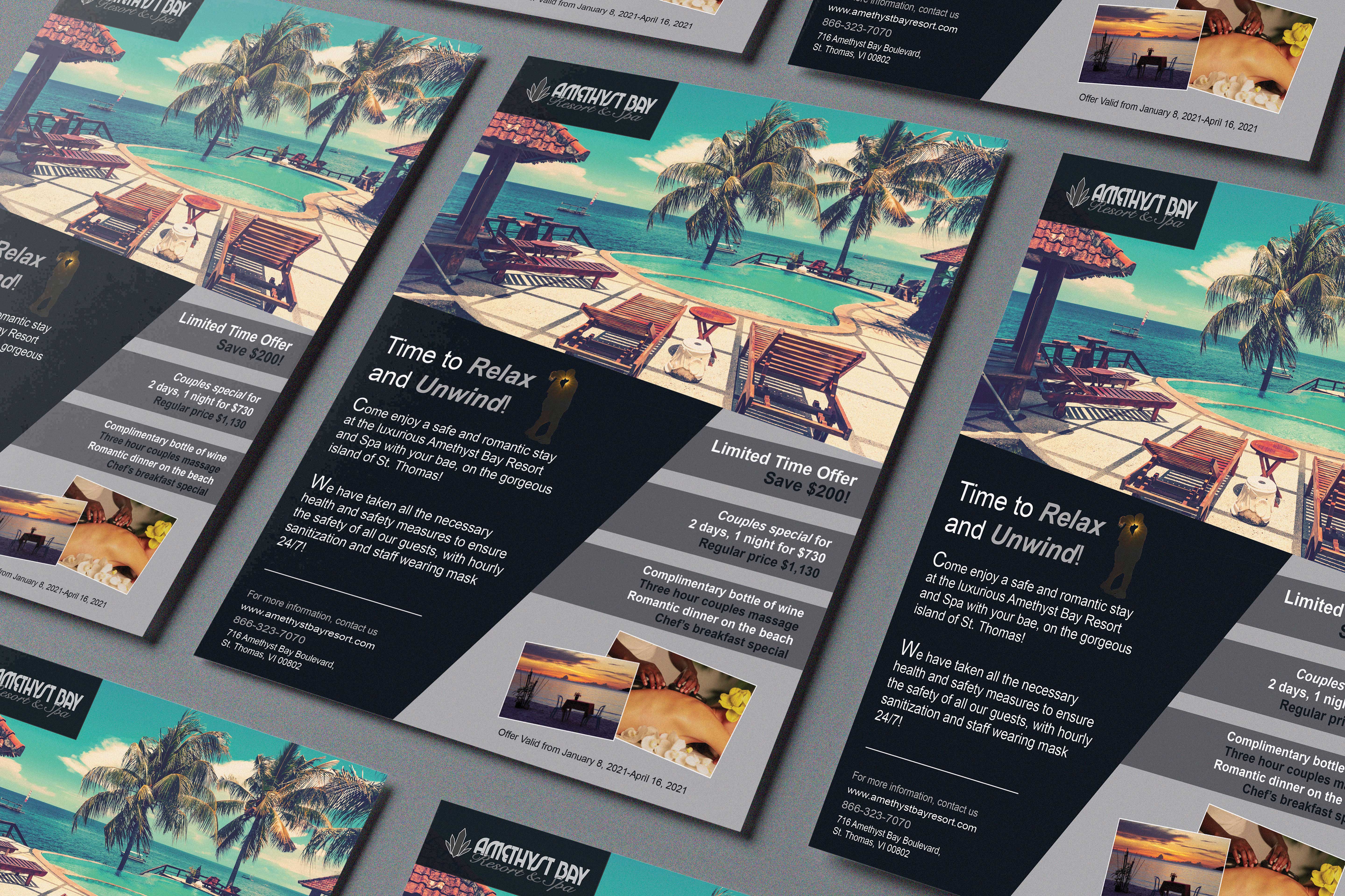
For this project, the main elements and principles of design employed are contrast and shape. I used very dark colors for my background and then used lighter color text and shapes to create contrast to then create emphasis on specific information. And I used darker colors to create a mood of calm and romance. On the right side of the page, I use grey and white to allow the main information to stand out and draw people to want more information and/or to book with the resort.

Originality
This project did require a lot of time, planning, and brainstorming in that this was one of my first real graphic design projects and I was still learning how to use the software and tools. So, there were milestones for every element; I had to gather images that I wanted to use and edit them in photoshop in some way, then I had to find one image to use the selection tool, and then I had to choose the color scheme I wanted. This took a substantial amount of time and searching through images to get to the final product. I think my efforts of creativity are very evident in this project. My thought process behind developing these pieces was that I wanted to veer away from the norm and what I knew everybody would do, so I wanted the resort and the special that was going on to be geared towards couples, and I wanted the ad and banner to feel more upscale and romantic. This Is why I chose darker colors and only stuck to two colors, with the images being the pop of color.

Evidence of Following Directions
The specifications/directions were to create a print-ready magazine ad and a web banner. If I remember correctly, it was specified to choose images and edit them in some type of way using photoshop, to create the web banner using the timeline panel in Photoshop, and to include some type of offer. I did all of this and made sure that I included everything on the rubric. I didn’t feel the need I deviate from the original direction of this project. I feel like it represents the resort, and it communicates their intended message effectively.
Back